Effects of Stadiums for Supercross Riders
3/9/2016
[Editor's Note: sorry, it takes a while to get to the graphs, and gets a little technical -- but hopefully it's worth it!]
This gets brought up fairly often: "Rider ABC always rides well at location XYZ". I think we all take statements like these with a grain of salt, but I think we'd mostly agree that there's some merit to this, even if it's probably exaggerated by some announcers or writers along the way. There are plenty of plausible reasons that rider might really do better in a certain stadium or city. I would think it's some mix of the stadium layout, the type of Supercross course that is usually built at that stadium, and the location of the city relative to the rider's home base, among other factors. The location likely matters not only because of travel distance (I think we would almost certainly see an effect for travel distance, as 538/Nate Silver showed for basketball in depth) but also because of familiar dirt, humidity, and other regional aspects.
So let's take a look. Unfortunately I have to do a lot of defining the parameters before getting to the numbers and graphs. I restricted my search to Supercross riders who raced in the same stadium (or arena/field/park/dome/etc.) at least twice in the past three years (2013 - 2015) and again in 2016. That left us with only five possible options for stadiums (nine weeks of 2016 races, but Anaheim 2 was a duplicate, Petco only had one Supercross race prior to 2016 (which eliminated two weeks of potential 2016 data), and University Of Phoenix Stadium was hosting its first ever Supercross race). Well, that wasn't so bad -- it felt like a lot more as I was gathering the data. I included both Upper (450) and Lower (250) classes, but the comparison is only with the rider's 2016 class. That left us with 96 total riders/races in 2016 that qualified, meaning they had ridden at least twice at the stadium in the same class prior to 2016 (65 were in 450SX; 31 were in 250SX).
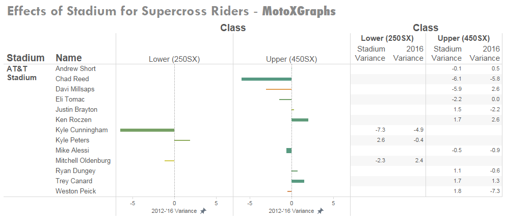
To analyze this, I set out to compare how each rider rode at a particular arena in the past versus the future, where in this case the "future" is 2016 events that already happened. The "past" is 2013 through 2015, which is a bit arbitrary, but I think going back any farther in time introduces too much variation: from aging improvement/decline and how similar the courses are from year to year, for instance. In the charts below, "Stadium Variance" will be our baseline, and is how the rider's results in the particular stadium compared to his average result overall. "2016 Variance" is same thing but in 2016 -- the rider's finishing position at the stadium compared to his average finish in the rest of 2016. Positive numbers are good, while negative numbers are bad; for instance, in the chart below (using AT&T Stadium as an example) Andrew Short was 0.1 spots worse at AT&T Stadium in Arlington than his average finishing spot up through 2015, but in 2016 at AT&T he was 0.5 spots better than his average. Davi Millsaps, third in the list, performed nearly 6 spots worse at AT&T historically, but finished 2.6 spots better in 2016.
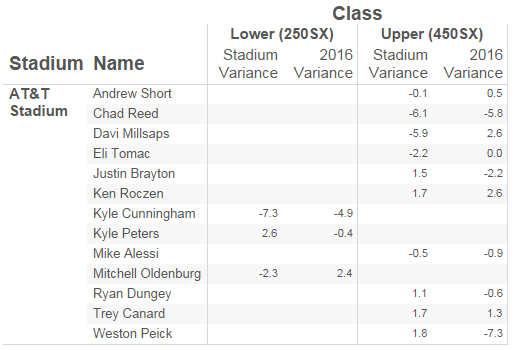
So Andrew Short and Davi Millsaps didn't show much of an effect -- our prediction based on 2013 through 2015 is that they would be expected to perform slightly worse at AT&T Stadium in 2016, but instead they performed better. So, the first test of a stadium effect is whether the 2016 prediction matches the direction of what actually happened -- essentially does the sign from the effect from 2013-2015 match the sign from the effect in 2016? If it were purely random, we'd expect the sign to match in 50% of the cases. Overall, 58% of the cases that we're looking at had matching signs for past and future. Here's the breakdown by stadium:
Angel Stadium -- 41%
O.co Coliseum -- 67%
AT&T Stadium -- 38%
Georgia Dome -- 74%
Daytona Int'l Spdwy -- 75%
We're dealing with a fairly small data set, so it's hard to draw conclusions, and I certainly wouldn't make any sweeping conclusions from it. I think we see an effect of this small data in Angel Stadium and AT&T Stadium numbers -- there's no way to explain the number being below 50% other than random chance. I mean there's no reason that the riders would behave in an opposite manner in 2016 versus the prior years. For AT&T, there were only 13 cases that fit our criteria, so there is definitely room for random variation, so it appears that with a sample set this small we have to accept a range of variation that's at least 12% as it was for AT&T since AT&T was 12% below the "random" 50% (or 9% for Angel Stadium, which had 32 cases).
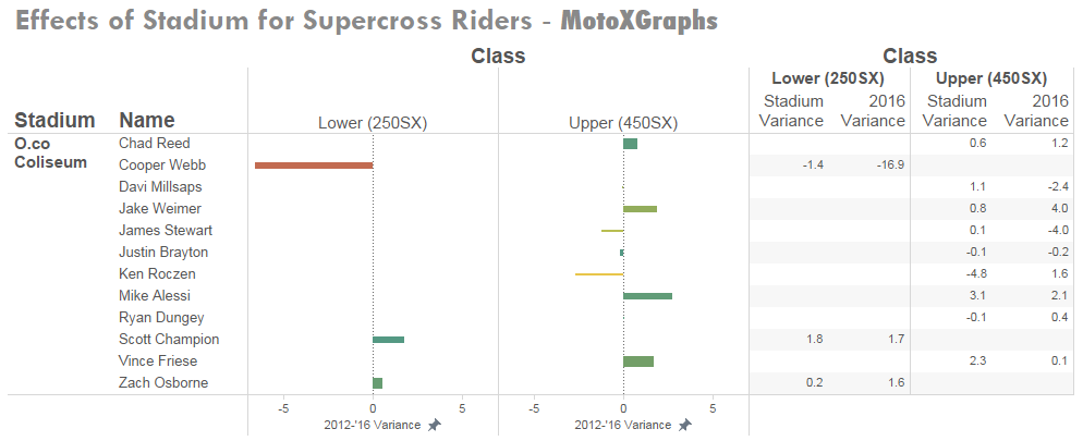
So, for O.co Coliseum, the 67% looks like there may be some effect, but we temper that slightly based on the variance that we just mentioned, especially since O.co only had 12 cases. If we think that the variation is somewhere around 9 to 12% as it was for Angel and AT&T, then it looks like O.co had some effect above that, though hard to call.
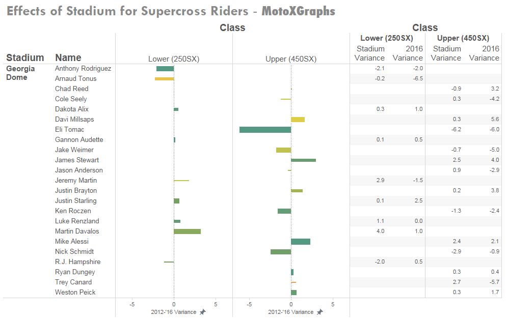
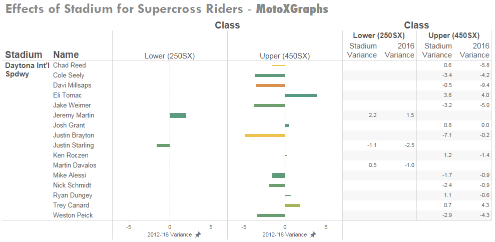
Now for the Georgia Dome and Daytona, there was a much bigger effect, one that appears to be real. Of course the caveats apply because of the limited data set, but the Georgia Dome had 23 cases to look at, which is a little bit better than O.co or AT&T. Daytona had 16, which falls between the Georgia Dome and O.co/AT&T. It's easy to apply some reasons to this apparent effect: travel distance for one, and the unique layout and setup of Daytona for another. But, it's easy to apply reasons even if the data isn't all that strong. In this case I think we take it for what it is -- evidence of some sort of effect at 3 of the 5 locations, and evidence of an effect overall because 58% is larger than 50% if it were random.
As mentioned above, Andrew Short and Davi Millsaps didn't show an effect at AT&T. On the other hand, Chad Reed has been 6 spots worse at AT&T historically, and in 2016 he continued that pattern, finishing about 6 spots worse than his average race in 2016. But how valid is that "historical" number for Reed -- how many races did he have at AT&T prior to 2016? Are we comparing 2016 with just 2 prior races, or are we talking about 4 or 5 or more? That's where we get to the real graphs. For each stadium, the riders who met the criteria are listed on the left. In the middle, the length of the bar shows the overall variation at the stadium compared to the rider's average (for instance, for Chad Reed above, that would be about 6 spots in the negative direction). The thickness of the bar represents how valid the data is -- if the bar is pencil-thin, that means the 2016 result didn't match the prediction based on 2013-2015 results. The thicker the bar gets, the more races that the rider had in his pre-2016 data. The color represents how close the variation in pre-2016 was to the variation in 2016, i.e. Chad Reed's bar for AT&T would be green because his 2016 number (-5.8) was nearly identical to his pre-2016 results (-6.1). If Reed had a variance of, say, -1.8 in 2016, the bar would be closer to the red end of the spectrum because even though the effect was in the same direction, it wasn't all that close to the predicted effect. On the right are the variances -- how well (or poorly) the rider performed at the particular stadium compared to their average race -- from 2013-2015 ("Stadium Variance") and in 2016 ("2016 Variance").
First, Angel Stadium:
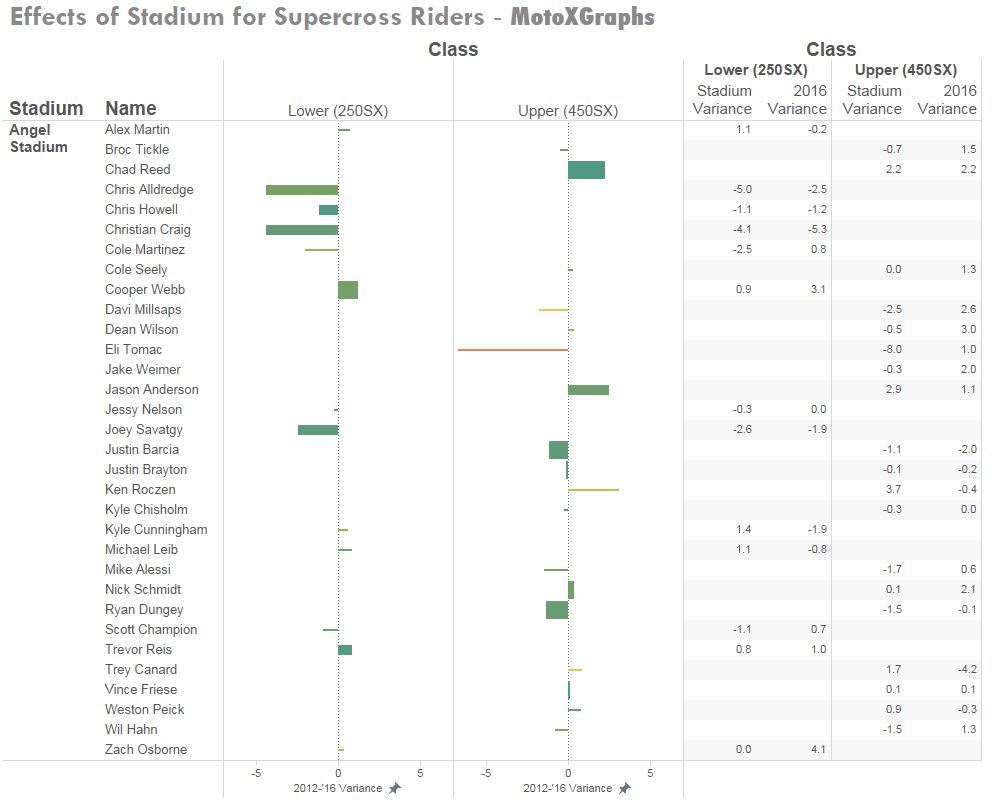
As mentioned, because of the large proportion of riders whose 2016 result didn't match the prediction, there are a lot of tiny little bars. I will mention Jason Anderson, though, who is often mentioned to ride well in Anaheim (we even took a one-paragraph look at it in the Week 1 Recap), and in the Angel Stadium graph he and Chad Reed are the ones who show the most prominent effect, both with green bars. Reed has a thicker bar because he's ridden 450SX at Angel Stadium more times than Anderson, but Anderson's bar is slightly longer, 2.5 vs 2.2 spots of variance. Again, limited data caveats, so it's hard to draw too much from this, other than the numbers match what we think we've been seeing with our eyeballs when it comes to Anderson at Anaheim.
OK, this is getting quite long, gotta finish up -- here are the other four:
(Josh Grant's number for 2016 is misrepresentative because he's only had one race.)
So that's it for now. This needs more data, so rather than go back in time I'll track through 2016 and maybe look at motocross for last season. I would really like for this to be solid enough to factor into the "This-Week" predictions, but I don't think it's quite there yet…
One final note is on that last chart, for Daytona, we see Eli Tomac, who historically finished 3.8 spots better than his average -- much higher than anyone else -- and as we all watched, he did it again last week, finishing 4 spots above his average while winning Daytona.
Posted by: SagehenMacGyver47 ::: As always – Feedback welcomed
Previous: 2016 Week 9 - By-The-Numbers Recap: Daytona | Back to Blog | Next: Short Track: Daytona "This-Week" Predictions Review